Your First RNA-Seq Analysis
A walkthrough for biologists with zero coding — using a published cardiac differentiation dataset, in your browser.
- 1 RNA-seq measures gene expression across thousands of genes per sample, letting you compare cell types, treatments, or disease states.
-
2
TransXplorer turns the entire workflow into one configuration screen and one click: load counts, set parameters, hit
Run DEG Analysis, and the platform does QC, batch correction, differential expression, pathway enrichment, and visualisation in one go. - 3 This walkthrough uses a real published dataset (GSE151427 — cardiac vs paraxial mesoderm endothelial cells) so you can see exactly what the outputs look like before trying your own data.
What RNA-seq analysis actually answers
Strip away the acronyms and it’s a comparison.
Every cell in your body carries the same DNA, but no two cell types do the same job. A neuron and a hepatocyte share an identical genome and yet behave nothing alike. The difference is which genes are switched on in each cell, and how loudly. That switching pattern — the transcriptome — is what RNA-seq measures.
RNA-seq works by extracting messenger RNA from a sample, fragmenting it, sequencing the fragments, and mapping each fragment back to a gene. The output is a table: roughly 20,000 rows (one per protein-coding gene) and one column per sample, where each cell holds a count of how many reads landed on that gene. From that count matrix flows everything else.
The question almost every RNA-seq experiment is built to answer is the same: which genes differ between two (or more) conditions, and what biology do those differences point to? Tumour versus healthy tissue. Drug-treated versus vehicle-treated. Wild-type versus knockout. Day 6 versus day 8 of a differentiation protocol. Whatever the contrast, the analytical task is the same: find the genes that move, and figure out what story they tell.
None of this is trivial. With ~20,000 genes tested at once, chance differences pile up — if you call a gene “significant” at p < 0.05, you’d expect roughly 1,000 false positives just from rolling dice that many times. Read counts are noisy: the same gene in the same condition can vary two- or threefold across biological replicates for entirely uninteresting reasons. Sequencing is technical: counts depend on library size, GC bias, and which day the samples ran on the machine. And the genes that change biologically may not be the ones with the biggest fold change — transcription factors often move modestly but downstream of them, structural genes shift dramatically.
Sorting through all of that — normalising for technical noise, modelling biological variability, correcting for multiple testing, translating gene lists into pathways — is exactly what software like TransXplorer is for. It does not do your biology for you. But it turns a count matrix into a ranked, statistically defensible, biologically grouped set of findings you can actually read, without having to write a line of code.
RNA-seq analysis is differential analysis. Counts in, ranked lists of biology-changing genes out. Everything else — normalisation, batch correction, dispersion estimation, multiple testing, enrichment — is machinery for getting that comparison right.
Meet your dataset: GSE151427
22 samples, two cell types, a beautifully clean question.
The dataset you’ll work with comes from Orlova et al. (2014, Arterioscler Thromb Vasc Biol), doi:10.1161/ATVBAHA.113.302598, deposited in NCBI GEO as GSE151427. The authors took human pluripotent stem cells and pushed them down two different developmental paths, both of which produce endothelial cells — the cells that line every blood vessel in your body.
One path goes through cardiac mesoderm and gives rise to CMECs (cardiac mesoderm endothelial cells), the cells that build the vessels feeding your heart. The other goes through paraxial mesoderm and gives rise to PMECs (paraxial mesoderm endothelial cells), which form trunk and limb vasculature. Under a microscope the two populations are indistinguishable: same shape, same markers like CDH5 and PECAM1, same overall endothelial identity. But put them in vivo and they make wildly different vascular beds. Something at the transcriptional level is encoding that fate decision.
The experiment is exactly the comparison you’d design to find it: 11 CMEC replicates and 11 PMEC replicates, harvested across two differentiation timepoints (day 6 and day 8), processed in two sequencing batches. The question is unambiguous — which genes differ between CMECs and PMECs? — and the biology is well enough characterised that you can sanity-check your results against published cardiac master regulators like GATA4, GATA5, HAND2, and MYL7, and paraxial markers like ALDH1A2, FZD10, and CTHRC1. If your pipeline returns those genes at the top of the list, you know the analysis is working.
- Accession
- GSE151427NCBI GEO
- Samples
- 2211 CMEC + 11 PMEC
- Batches
- 2day 6 + day 8
- Organism
- H. sapienshPSC-derived
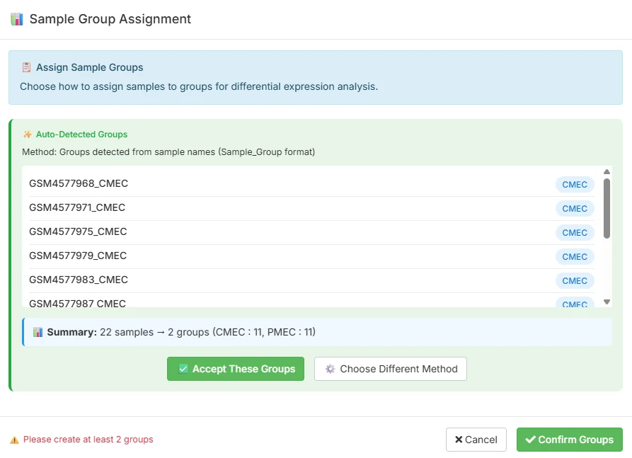
TransXplorer ships this dataset as an example so you don’t need to download anything to follow along. From the analysis screen you’ll see a one-click Load Example Counts shortcut that pulls in the count matrix and the sample metadata together. The first thing TransXplorer does is something useful and quietly clever: it parses the sample names and auto-assigns them to groups, so the 22 samples come in already sorted into 11 CMEC and 11 PMEC. You confirm the assignment with one click and you’re ready to configure.
You can read the original GEO record at ncbi.nlm.nih.gov/geo/query/acc.cgi?acc=GSE151427 for the full experimental design, library preparation details, and original processed counts.
The TransXplorer workflow — configure once, click once
One sidebar. One button. Everything else is downstream.
Most RNA-seq pipelines spread the work across half a dozen scripts, tabs, or notebooks. TransXplorer collapses it into a single screen called Transcriptome Analysis. On the left you have a sidebar where you load data and set parameters; on the right, an empty canvas waiting to fill with results. There is one action button, and it is named exactly what it does.
Step 1 — load your data
Three options live side by side. Import from GEO takes any GSE accession and pulls counts and metadata directly from NCBI. Upload counts accepts a CSV of genes by samples with a separate metadata sheet. Load Example Counts drops in the GSE151427 dataset described above. For this walkthrough, click the example button.
Step 2 — set the parameters
Underneath the data loader, the sidebar exposes the choices that actually shape your analysis. Everything has a defensible default; you only change what you need.
-
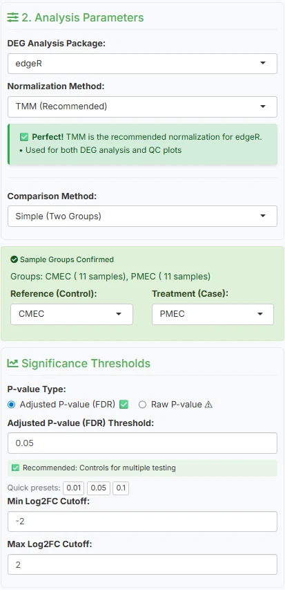
DEG analysis package
edgeR (default)PickDESeq2,edgeR, orlimma-voom. All three are well-established, peer-reviewed, and widely cited; any is defensible in a paper. The screenshot below shows edgeR. -
Normalisation method
TMMPairs canonically with your DEG choice —TMMfor edgeR, median-of-ratios for DESeq2,voomfor limma. Each accounts for library-size differences across samples in a slightly different way. -
Comparison method
Simple (Two Groups)For this dataset, a straight two-group test. Multi-factor and complex designs are available for experiments with treatment, time, and batch interacting. -
Reference vs treatment
CMEC → PMECSet CMEC as reference (control) and PMEC as treatment (case). This matters for sign interpretation: a positive log2FC will mean “higher in PMEC” and a negative one “higher in CMEC.” -
Significance thresholds
padj < 0.05, |log2FC| > 2A focused, strongly-changing set. Loosen|log2FC|to 1 if you want a broader screen; tightenpadjto 0.01 for a stricter hypothesis-generating set.
Step 3 — click the button
Underneath the parameters is a single primary action: Run DEG Analysis. This is the only button you need to click. It triggers the full pipeline: quality control on every sample, automatic batch-effect detection across four metrics (PVCA, kBET, silhouette, combined), limma::removeBatchEffect correction if the metrics flag batch as a problem, the differential expression test you configured, pathway enrichment on the resulting DEG list, and the full visualisation suite. End-to-end takes roughly 30 to 90 seconds, depending on dataset size.
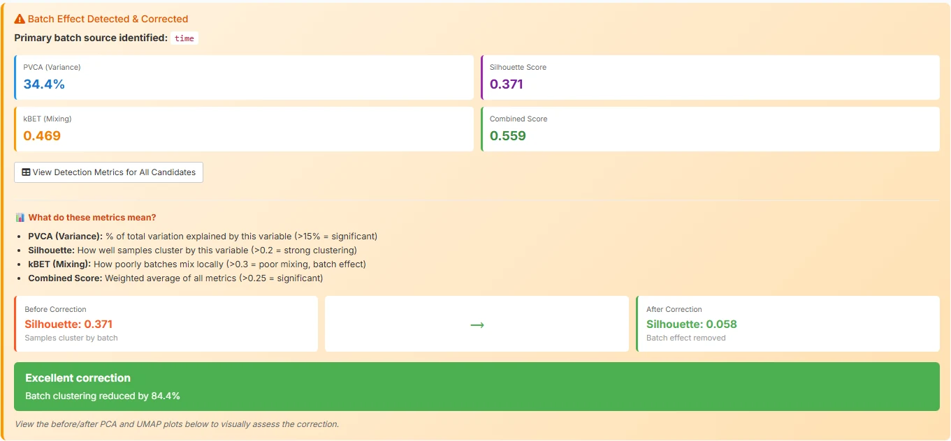
limma::removeBatchEffect — reducing batch clustering by 84.4%.The difference between a tool that requires a methods chapter to operate and one that lets a biologist focus on the biology is exactly this: collapsing a six-tab click-through into a single configured run. The pipeline did not get simpler — QC, batch correction, dispersion estimation, multiple-testing correction, and enrichment all still happen — it just stopped asking you to babysit each step.
Reading your results — the three views that matter
A volcano, an enrichment chart, and a heatmap. That’s most of what you need.
When the run finishes you’ll see a multi-panel results view: tables, plots, downloads. Three of those panels carry most of the information you actually want, and learning to read them is most of what learning RNA-seq analysis is about.
4a. The volcano plot — where the action is
A volcano plot is the single most useful chart in differential expression. Every dot is one gene. The x-axis is log2FC — how much the gene changed, on a log scale. The y-axis is -log10(padj) — how statistically convinced we are that the change is real. Bigger movements push dots outward; stronger statistics push dots upward. The most interesting genes end up in the top corners.
Because we set CMEC as the reference and PMEC as the treatment, the sign convention is straightforward: negative log2FC (left, blue) means higher in CMEC, and positive log2FC (right, red) means higher in PMEC. Dashed lines mark the thresholds you set in the sidebar — vertical lines at log2FC = ±2, a horizontal line at padj = 0.05. Anything past both lines is on your DEG list. Anything in the bottom-middle blob is statistical noise: small effects, weak evidence, mostly housekeeping.
The fastest way to gut-check an analysis is to look at what’s in the top corners and ask: do these genes match the biology I expect?
Hover over the top-left for this dataset and the cardiac master regulators land in your lap. GATA4 sits at log2FC = -5.75 with padj ≈ 1×10-14 — a 53-fold higher level in CMECs and a p-value so small it’s effectively asserting certainty. GATA5, MYL7, HAND2, and SMAD6 sit right next to it. Every one of those is a canonical cardiac transcription factor or structural protein. The biology isn’t whispering; it’s shouting.
Hover the top-right and you get the paraxial mesoderm story. ALDH1A2 at log2FC = +7.24 — a retinoic-acid synthesising enzyme that’s a textbook paraxial-trunk marker. FZD10 at +5.52, a Wnt receptor; CTHRC1 at +4.33, a Wnt-pathway modulator; TNFRSF19 at +4.24. Wnt signalling everywhere, exactly what you’d expect for trunk mesoderm patterning.
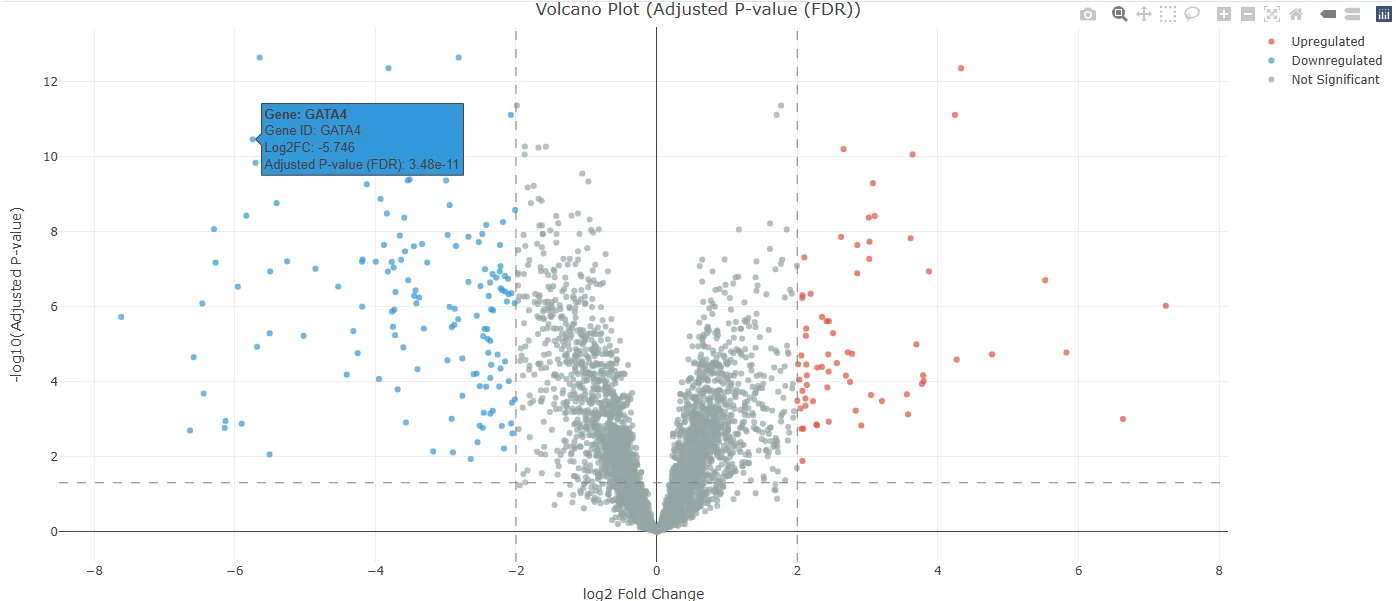
log2FC = -5.75, padj = 3.48e-11 — one of the strongest cardiac signals you’ll ever see in a screen.Now hover over your own version
The static screenshot above is the panel inside the TransXplorer app. The plot below is the same data, embedded live so you can hover, zoom, pan, and toggle direction groups. Try it: hover over the top-left dot for GATA4, drag-select a region to zoom, click the legend entries to hide and reveal cell-type groups.
Live: hover any point to see the gene, log2FC, and adjusted p-value. Click the legend to toggle direction groups. Top hits are labelled.
| Gene | log2FC | padj | Direction | Biology |
|---|---|---|---|---|
| GATA4 | -5.75 | 9.7e-15 | up in CMEC | Cardiac master transcription factor |
| GATA5 | -5.83 | 1.0e-13 | up in CMEC | Endocardial / cardiac TF |
| MYL7 | -5.95 | 9.1e-12 | up in CMEC | Atrial myosin light chain |
| SMAD6 | -5.64 | 3.8e-15 | up in CMEC | BMP-pathway inhibitor, cardiac |
| ALDH1A2 | +7.24 | 1.1e-07 | up in PMEC | Retinoic acid synthesis, paraxial |
| FZD10 | +5.52 | 2.8e-12 | up in PMEC | Wnt receptor |
| CTHRC1 | +4.33 | 3.8e-15 | up in PMEC | Wnt-pathway modulator |
| TNFRSF19 | +4.24 | 3.8e-14 | up in PMEC | TROY, neural / paraxial |
4b. Pathway enrichment — what biology emerged
A list of gene symbols, even a great one, is just a list. The interpretive jump happens when you ask whether those genes share a function. That’s pathway enrichment: take your DEG list, intersect it with curated gene sets that represent known biological processes, and find the sets that are unexpectedly over-represented.
TransXplorer runs enrichment automatically as part of Run DEG Analysis — by default against the Gene Ontology Biological Process database (GO:BP). You don’t configure it, you don’t click anything extra; when the volcano appears, the enrichment panel appears alongside it.
For this dataset, the top hit is the one you want to see: Heart Development (GO:0007507), driven by CMEC-up genes. Right behind it sit Cardiac Muscle Tissue Development, Negative Regulation of Multicellular Organismal Process, and various branches of MAPK-cascade regulation. In one panel, the platform has translated “here are 212 differentially expressed genes” into “these cells differ in their heart-development programme.” That sentence is the entire point of running an enrichment.
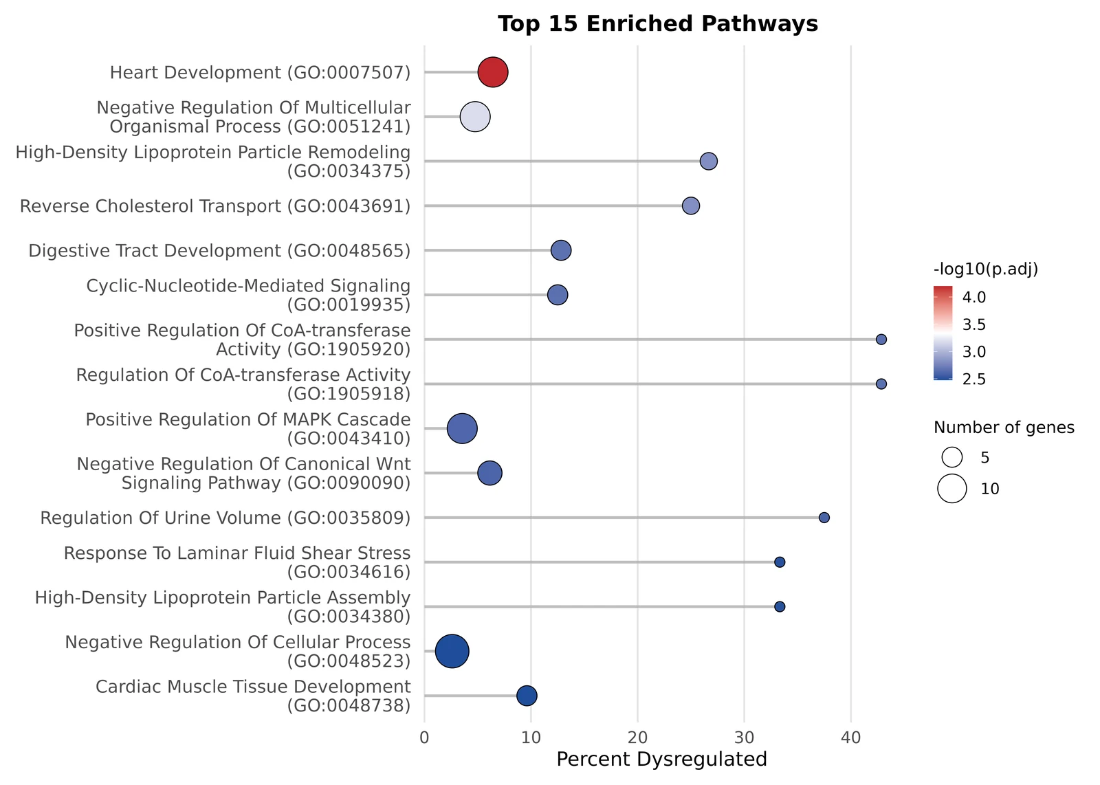
A small subtlety worth understanding: TransXplorer’s default is over-representation analysis (ORA), which tests whether your significant DEG list is enriched for a pathway compared to the background of all measured genes. There’s a sister method, GSEA, that uses every gene ranked by fold change and is more sensitive to coordinated subtle shifts. For a deep dive on when to pick which, see the methods page linked below.
4c. The heatmap — visual confirmation
The third panel is your sanity check. TransXplorer takes the top 50 DEGs and clusters them — both rows (genes) and columns (samples) — producing a heatmap where rows are genes, columns are samples, and the colour at each cell shows expression level (red high, blue low). Above the columns sit annotation tracks: one row showing Group (CMEC vs PMEC) and one row showing Batch (day 6 vs day 8).
You’re looking for two things. First, do the samples cluster cleanly by group? The column dendrogram should split into two big branches, one all-CMEC and one all-PMEC. If a CMEC sample wanders into the PMEC cluster, you have a labelling problem or an outlier. Second, do the gene blocks pop? The CMEC-up half of the gene list should glow red on the CMEC columns and blue on the PMEC columns. The PMEC-up half should do the opposite. Sharp diagonal contrast is what you want.
The Batch row is where you confirm that batch correction actually worked. If batch were still driving variation, the column clustering would split by day rather than by cell type — day-6 CMECs would cluster with day-6 PMECs against day-8 of both. Here, the Batch row is scrambled across the column dendrogram, which is exactly what you want: limma::removeBatchEffect did its job and the biology took over.
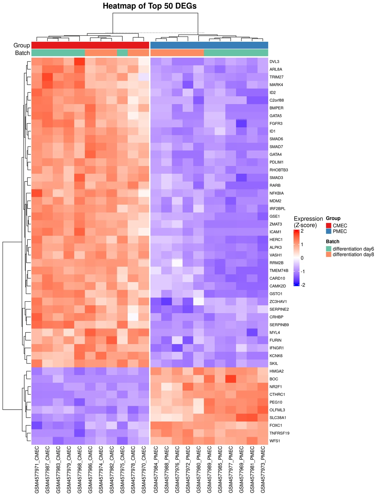
Volcano tells you which genes moved. Enrichment tells you what those genes do collectively. Heatmap tells you whether you can trust the result. If all three agree — identity-defining genes at the top of the volcano, a relevant pathway leading the enrichment, and a heatmap that splits by biology rather than batch — you have a result worth writing up.
What’s next
Bring your own data, go deeper on the methods, or open the full in-app tour.
Try it with your own data
The example dataset exists so you can see what the outputs look like before committing time to your own. When you’re ready, three on-ramps lead into TransXplorer’s analysis screen. Counts CSV is the fastest: drop in a CSV of genes × samples with a separate metadata file describing sample groups. GEO import takes any GSE accession — type GSE12345, hit fetch, and TransXplorer pulls the counts and metadata from NCBI directly into the analysis. FASTQ processing is for when you’ve received raw reads from a sequencing facility: a separate FASTQ Processing tab runs Salmon to align and quantify, then deposits the count matrix straight into the analysis screen.
Go deeper on the concepts
This walkthrough kept things at the level of “what you’re looking at and what it means.’’ The companion concept pages do the methods-level deep dives: what the statistical models actually do, when to pick one over another, what the failure modes look like.
Want the complete in-app walkthrough?
Every panel, every option, every export — with the actual TransXplorer interface in front of you. Open TransXplorer and click Tutorial in the navbar.
If TransXplorer helps your research, please cite us
The preprint is open access on bioRxiv. A peer-reviewed version is in submission.
Frequently asked questions
Do I need to install anything?
Can I use my own data?
GSE ID fetched directly from NCBI), or raw FASTQ processed through the FASTQ Processing tab (Salmon under the hood).